BRAD
BURY
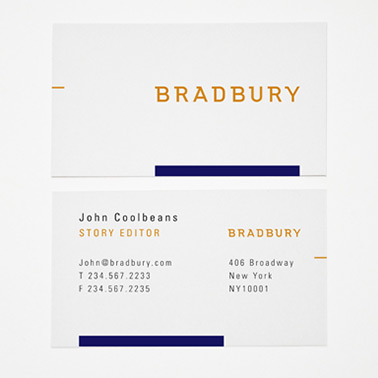
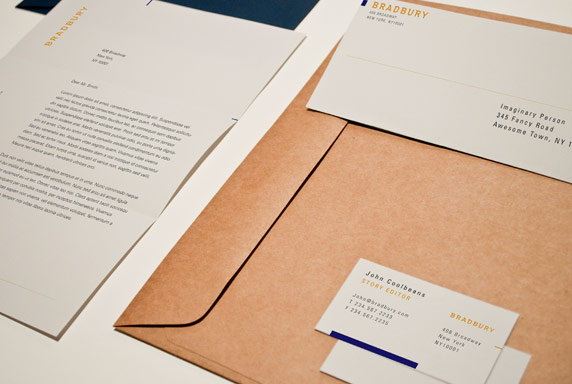
 Bradbury was a company created for one of my typography classes. Bradbury was a publishing company that would provide children's literature from classics to more modern titles in an interactive ebook form available for iPads, e-readers, other tablets and computers. The images in this section focus on stationary application of the logo: letterhead, business card, envelope.
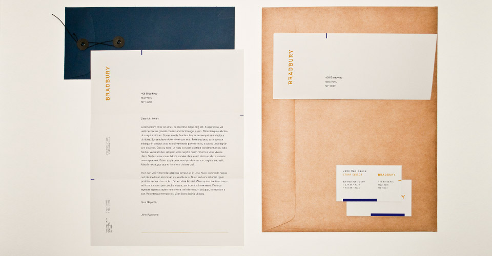
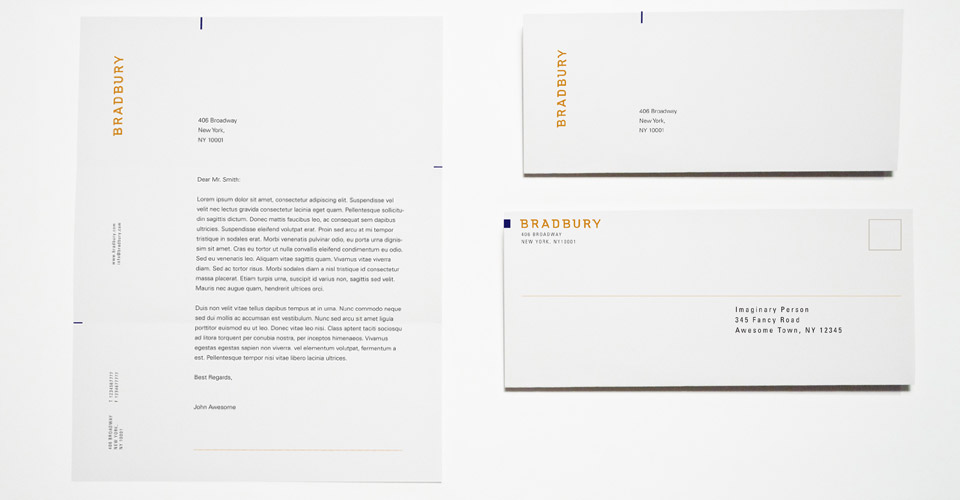
The letterhead ended up as one of my favorite pieces, because of the composition of the elements. Especially the small navy rectangles on the left and right side of the page, which indicate the fold.
Bradbury was a company created for one of my typography classes. Bradbury was a publishing company that would provide children's literature from classics to more modern titles in an interactive ebook form available for iPads, e-readers, other tablets and computers. The images in this section focus on stationary application of the logo: letterhead, business card, envelope.
The letterhead ended up as one of my favorite pieces, because of the composition of the elements. Especially the small navy rectangles on the left and right side of the page, which indicate the fold.
WORK
STILL
ALIVE